If you have spent any time doing frontend development, you have probably felt the confusion. Should this navigation bar use Flexbox? Should the page layout use Grid? Can you use both? What happens if you use the wrong one? A lot of developers — including experienced ones — just pick whichever they are more comfortable with and call it a day. But there is a better way.
This guide will give you a clear mental model for choosing between CSS Flexbox and CSS Grid, with real-world use cases, common mistakes to avoid, and code examples you can actually use. By the end, you will stop guessing and start making confident layout decisions.
The Core Difference in One Sentence
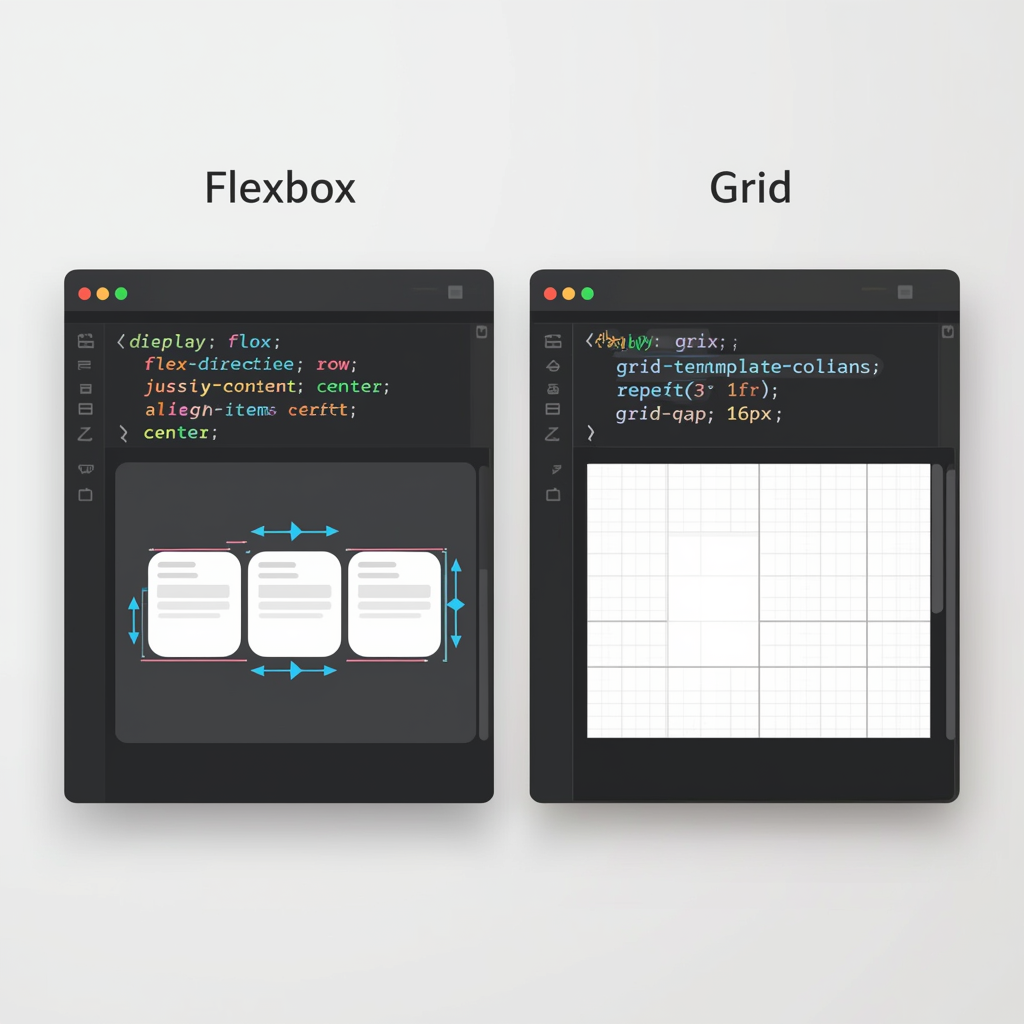
Flexbox is for one-dimensional layouts (either a row OR a column). CSS Grid is for two-dimensional layouts (rows AND columns simultaneously). If you only remember one thing from this article, remember that distinction. Everything else flows from it.
Understanding CSS Flexbox
What Flexbox Is Best For
Flexbox is the perfect tool when you need to arrange items in a single line — horizontally or vertically — and you want flexible control over how they grow, shrink, and align. Navigation menus, button groups, card rows, form controls, and centering elements are all classic Flexbox use cases. Think of Flexbox as controlling a train: you manage how the carriages are spaced, sized, and aligned along a single track.
Flexbox Core Properties You Must Know
The container properties are: display: flex (activates Flexbox), flex-direction (row or column), justify-content (alignment along the main axis — think horizontal spacing like space-between or center), align-items (alignment on the cross axis — think vertical centering), and flex-wrap (whether items wrap to a new line when the container is full). The item properties are: flex-grow (how much an item expands relative to siblings), flex-shrink (how much it shrinks), flex-basis (the starting size before growing or shrinking), and align-self (override the container's align-items for one specific item).
The Classic Flexbox Problem: Centering
Before Flexbox, centering something both vertically and horizontally was notoriously frustrating. With Flexbox, it is three lines: set the parent to display: flex, then justify-content: center, then align-items: center. This is now one of the most common uses of Flexbox in real projects.
Understanding CSS Grid
What Grid Is Best For
CSS Grid excels when you need to control both rows and columns at the same time. Page layouts with headers, sidebars, main content areas, and footers are ideal Grid use cases. So are image galleries, dashboard interfaces, and any design where you need items to align in both directions simultaneously. Think of Grid as laying out a spreadsheet: you define rows and columns, then place items precisely where you want them.
Grid Core Properties You Must Know
On the container: display: grid activates Grid, grid-template-columns defines column sizes (e.g., '1fr 2fr 1fr' creates three columns), grid-template-rows defines row sizes, gap sets spacing between cells, and grid-template-areas lets you name sections of your grid for intuitive placement. On items: grid-column and grid-row let items span multiple columns or rows, and grid-area assigns an item to a named area.
The Power of the fr Unit
The fr (fraction) unit is Grid's secret weapon. When you write grid-template-columns: 1fr 2fr 1fr, you are saying: divide the available space into 4 parts, give the middle column 2 parts and the others 1 each. This automatically adapts to any container size without fixed pixel values, making fully responsive layouts remarkably simple.
When to Use Flexbox vs Grid: A Clear Decision Framework
Use Flexbox When:
You are arranging items in a single row or column. The content determines the size of cells (items shrink and grow based on content). You need alignment tools like space-between or space-around. You are building navigation bars, button toolbars, icon rows, or any linear list of items. You want items to naturally wrap to a new line when space runs out.
Use Grid When:
You are building a full page layout with multiple regions. You need to control both rows and columns at the same time. You want items to align across both axes (perfect grid alignment). You are creating complex designs where layout matters more than content flow — like a magazine-style layout, a card grid with equal height columns, or a dashboard.
Can You Use Both?
Absolutely — and experienced developers do this all the time. A common pattern is using Grid for the overall page structure (defining the header, sidebar, main content, and footer regions) while using Flexbox inside each of those regions to arrange the internal content. Grid and Flexbox are complementary tools, not competitors.
5 Common Mistakes Developers Make
The first mistake is using Flexbox for everything including complex two-dimensional layouts — this leads to fragile, hacky solutions. The second is overcomplicating Grid for simple one-directional layouts that Flexbox handles in two lines. The third is forgetting that Grid's implicit rows can cause unexpected layout breaks — always define grid-template-rows when you have complex designs. The fourth is not using minmax() with Grid, which prevents columns from getting too narrow on small screens. The fifth is not testing with Dev Tools — both Chrome and Firefox have excellent Flexbox and Grid inspectors (press F12 and look for the flex and grid badges in the Elements panel) that visually show you exactly what is happening.
Quick Reference: Real Project Examples
Navigation bar with logo on left and links on right — use Flexbox with justify-content: space-between. Full website layout with header, sidebar, content, and footer — use Grid. A row of product cards that should wrap to multiple rows — use Grid with auto-fill columns. Centering a modal or hero text on screen — use Flexbox. A photo gallery where images align in neat rows and columns — use Grid. A form with labels and inputs side by side — use Flexbox or Grid (either works, Grid gives more control).
Browser Support
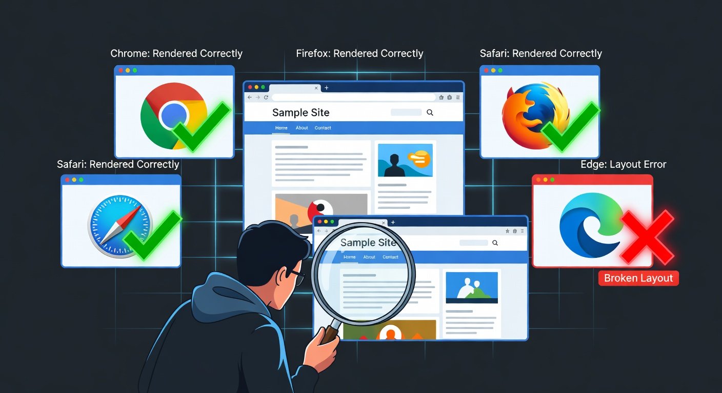
Both Flexbox and CSS Grid have excellent browser support in 2025, covering all modern browsers including Chrome, Firefox, Safari, and Edge. You do not need prefixes or polyfills for any current browser. The only concern is very old browsers like IE11, which has partial and buggy Grid support — but if you are not required to support IE11 (and most projects are not), you can use all modern Grid features without hesitation.
Conclusion
The Flexbox versus Grid debate has a clear answer once you understand what each tool is designed for. Flexbox handles one-dimensional flow. Grid handles two-dimensional structure. In practice, the best websites use both — Grid for the big picture layout and Flexbox for the fine-grained alignment within components. Master both, know when to reach for each, and your CSS will be cleaner, more maintainable, and far easier to make responsive.